[BRIEF]
01
One hub for every point and dollar you earn.
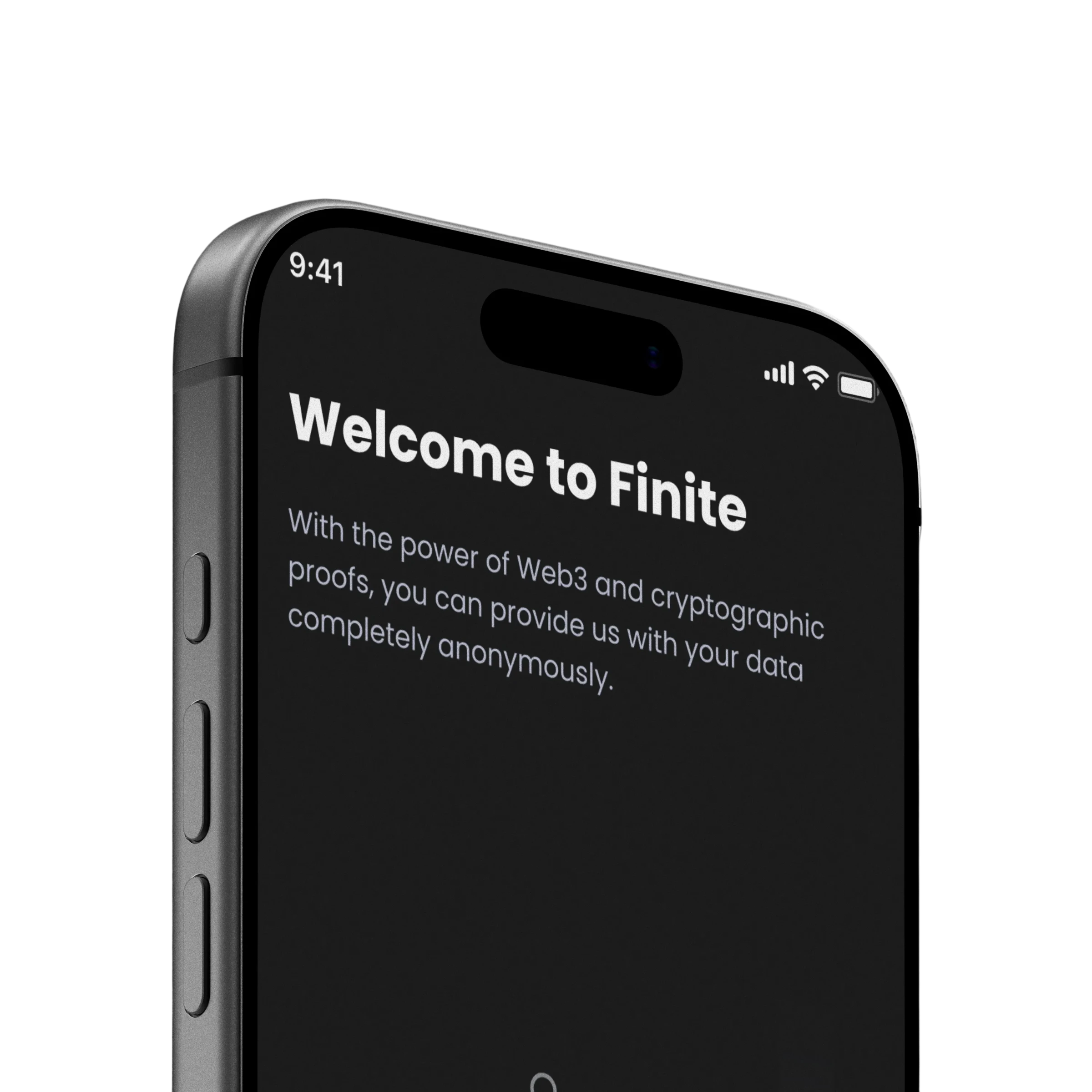
Finite is FreedomPay’s mobile rewards app. It brings loyalty points and cashback into one place, so users can see and grow everything they earn.
I led the redesign end to end: the vision, the research, the product direction and the junior designers who brought it to life. Three months, a team of eleven, and a full move to dark mode.
[CHALLENGE]
02
Users felt lost. The app’s best feature was buried.
Users couldn’t tell where they were, couldn’t find the primary action, and dropped off in flows that were longer and more ambiguous than they needed to be. The design challenge was to make the concept and its benefits clear from the first screen.

Vague navigation
Users couldn’t tell where they were or how to complete simple tasks, a loss of context.

Poor hierarchy
No clear primary buttons and hard-to-find inputs made users hunt for functionality, which raised cognitive load.

Complex user flows
Earning and transferring points, the core value of the app, was buried under convoluted steps and ambiguous icons. Users dropped off.
[STRATEGY]
03
Understanding the whole ecosystem.
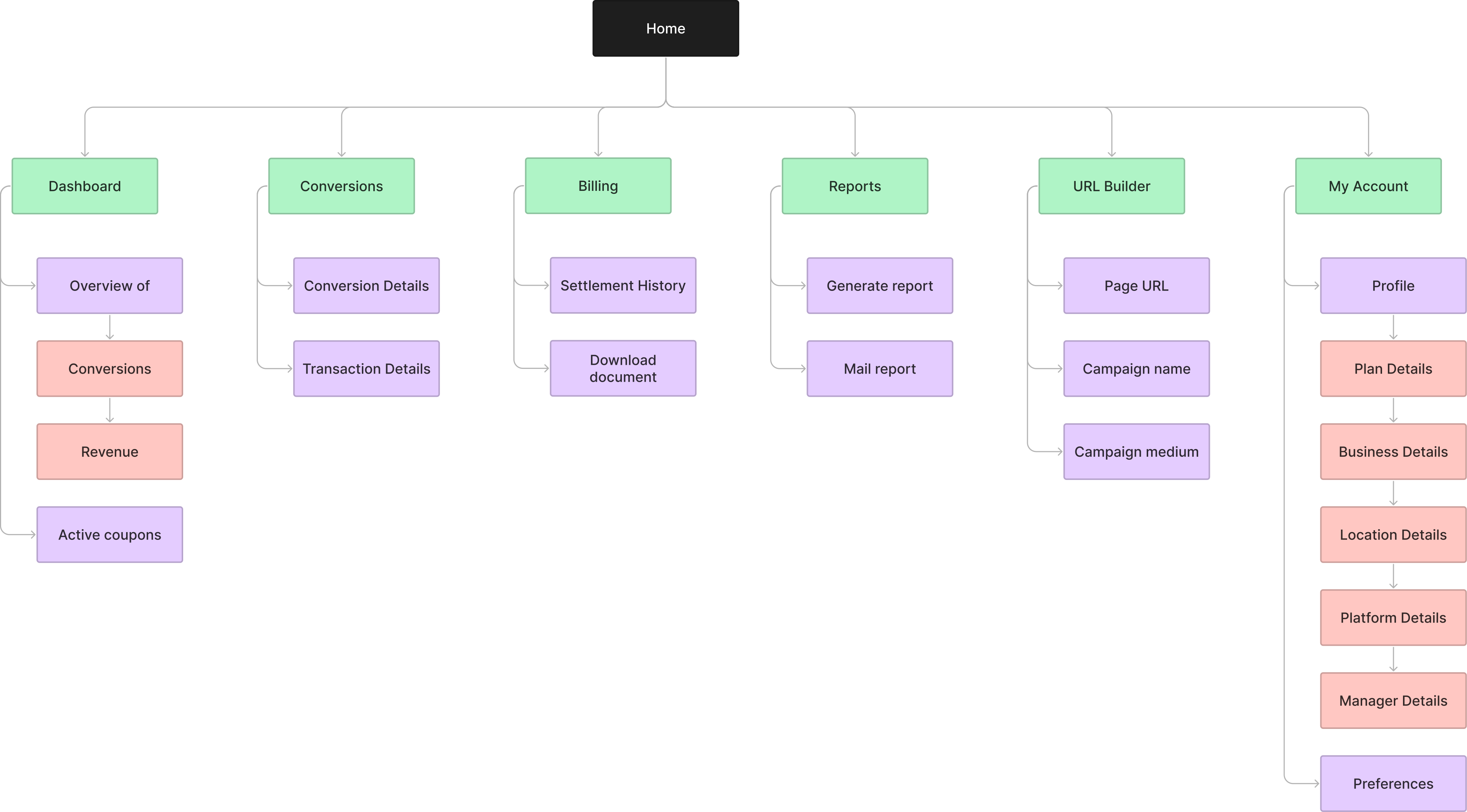
I started with a research audit across loyalty programs, Web3 technologies, data privacy and Gen Z behavior, to understand what builds trust and what makes a rewards program stand out. A concept map of loyalty systems gave the redesign its structure.
User Interviews
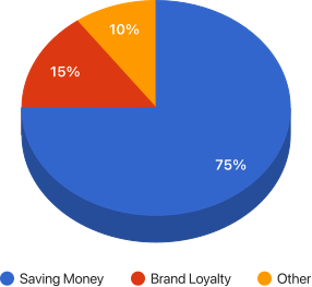
User interviews confirmed that the primary motivation for this demographic is saving money, making convenience and trust paramount for continued engagement.
Key Drivers for Program Adoption
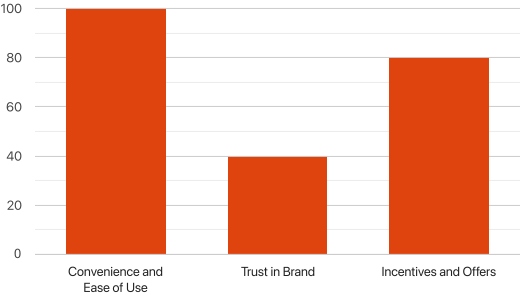
Research highlighted three critical factors influencing a user's decision to adopt and continue using a rewards program.
Concept Mapping
After getting a better grasp of the problem statement via secondary research, we decided to chart out a concept map which would help us understand loyalty systems and their inner components. The concept map would help us provide a structure to build the redesigned app upon.
[IDENTITY]
04
Clear from the first screen to the last card.
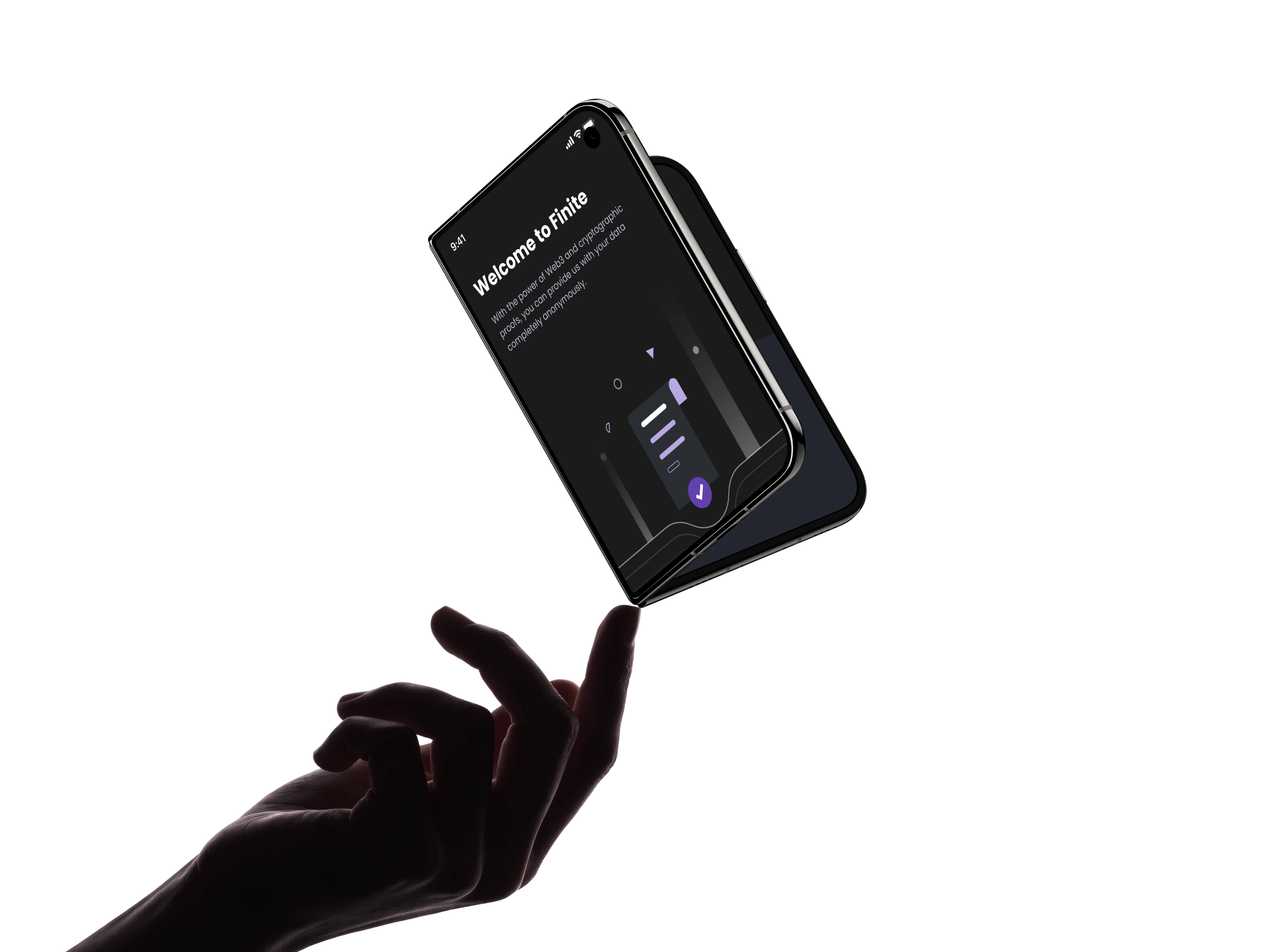
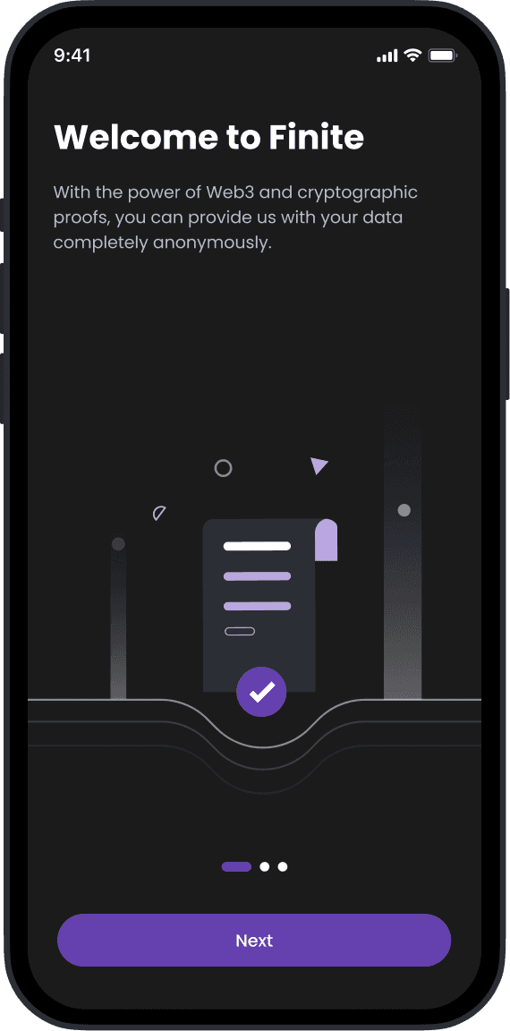
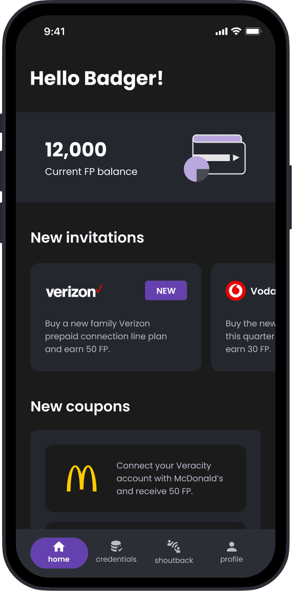
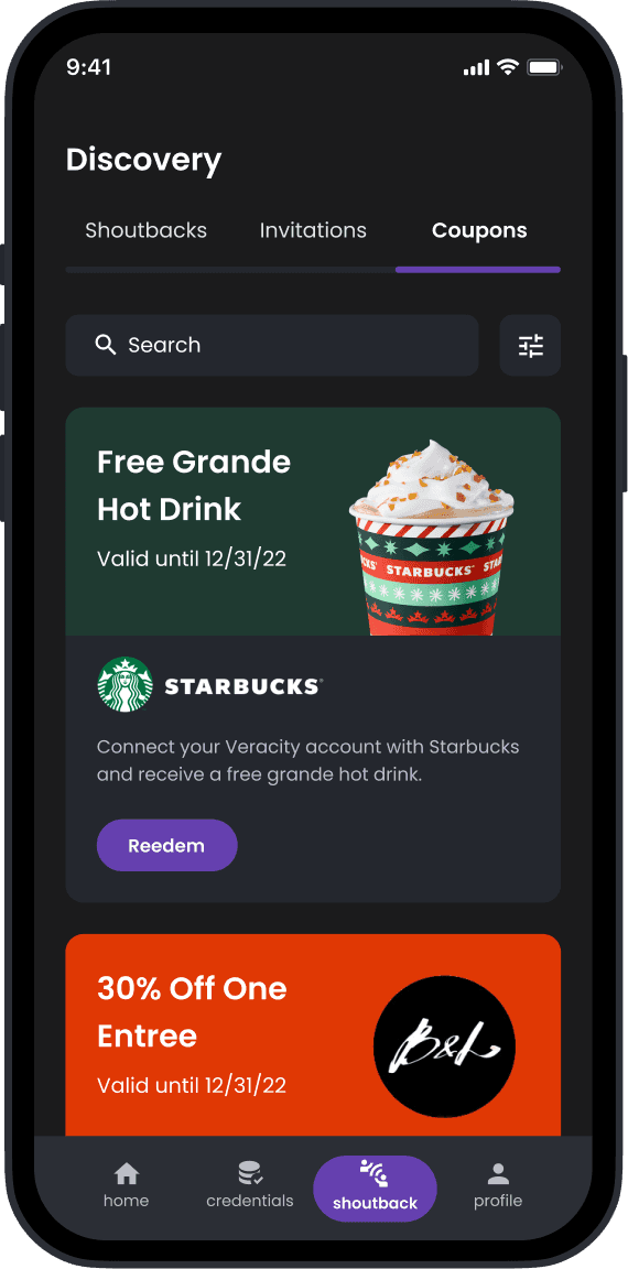
Guided onboarding explains what the app is for, introduces its main parts and shows how users benefit. The homepage opens with a zero state of context cards, then fills with the FP balance, new invitations and coupons.
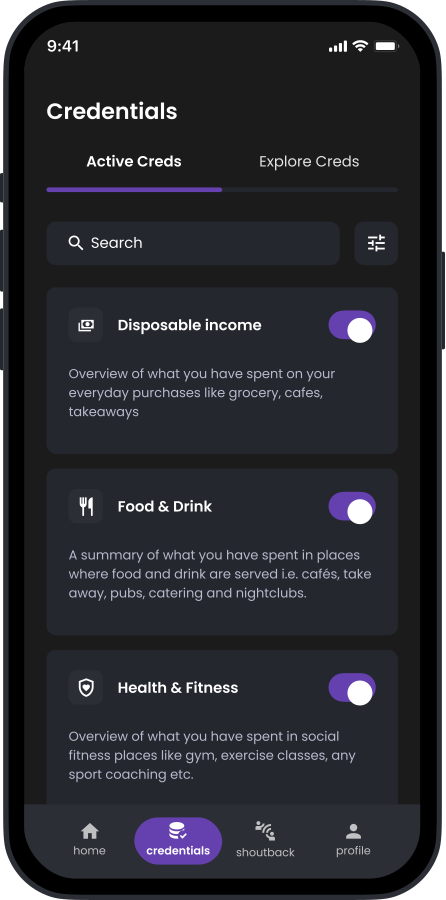
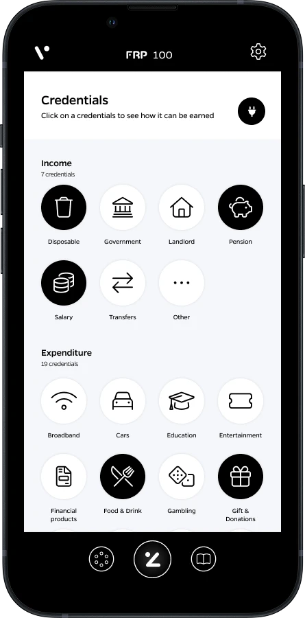
The old credentials screen was a wall of icons with no descriptions. Each became a card with a status and a description, with filters for easier navigation.
[RESULTS]
05
Clear from the first screen to the last card.
Clearer flows cut early confusion, and a structured way of working helped the team move faster. Close work with engineers kept the final design efficient to build.