[BRIEF]
01
Making interviews simpler, from start to finish.
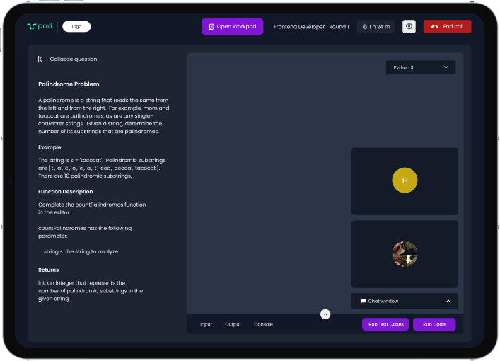
POD is a recruitment platform connecting academia, companies, students and alumni. As the platform evolved, its experience needed a rethink. Essential functionalities were scattered, navigation felt disconnected, and users had to spend more time managing the interface than focusing on the interview.
[CHALLENGE]
02
Too many steps. Too much friction.
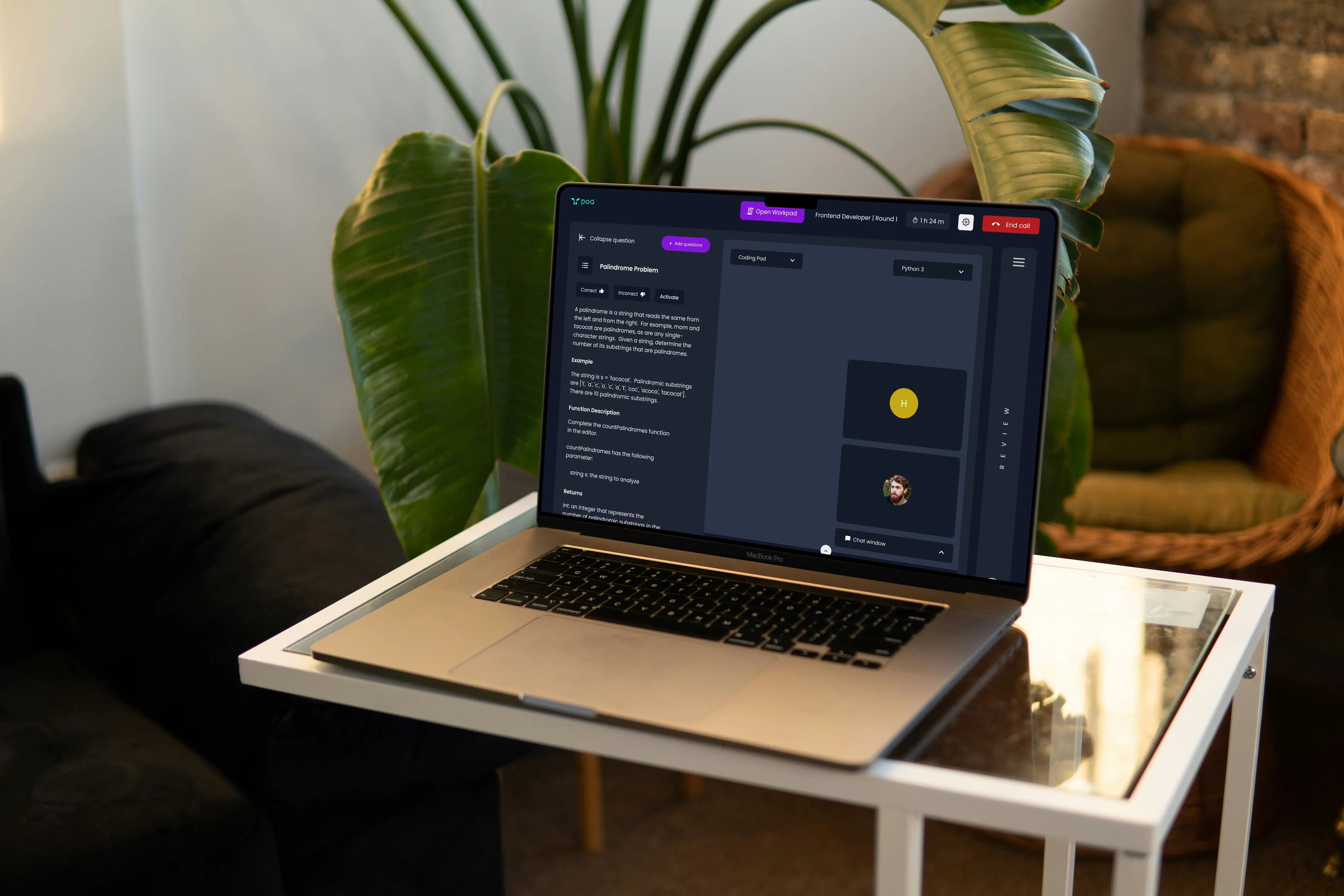
The existing platform made something as important as an interview unnecessarily complicated. The challenge was to bring these fragmented experiences together without overwhelming either side of the interview.
1.
High cognitive load
Users had to spend too much mental effort understanding the interface and completing basic tasks.
2.
Scattered functionalities
Users had to spend too much mental effort understanding the interface and completing basic tasks.
3.
Disconnected user flows
There was no clear journey connecting interview preparation, the interview itself and candidate evaluation.
[STRATEGY]
03
Understanding both sides of the interview.
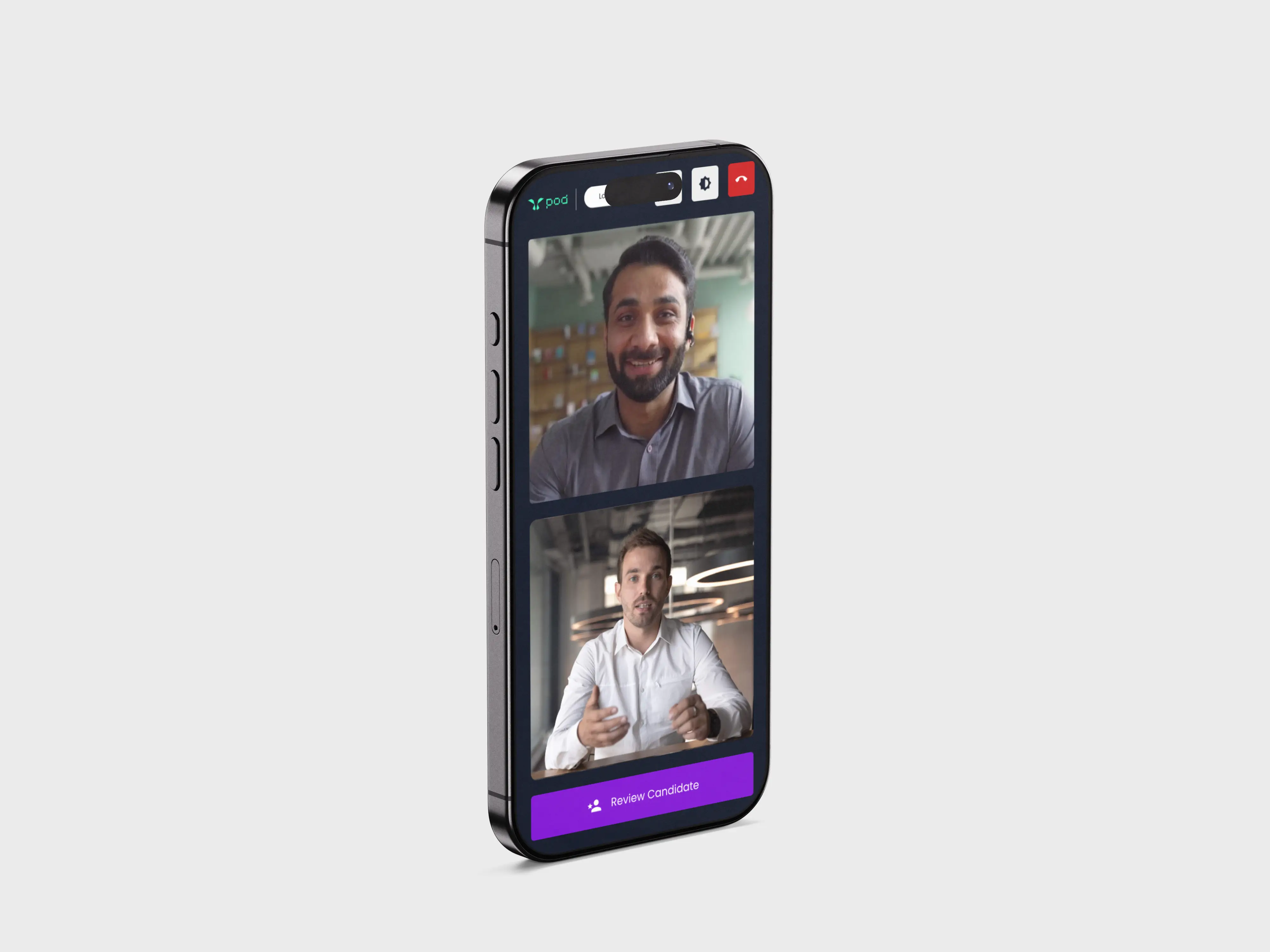
We approached the redesign by looking at the two primary user groups: interviewers and interviewees. Through competitive analysis, user interviews and usability testing, we explored what users needed from the platform and where the existing experience was falling short.
Competitive Analysis
We analyzed competing products to understand their features, navigation, interview workflows and user experience, identifying effective patterns and opportunities to improve the experience for interviewers and candidates.
Information Architecture
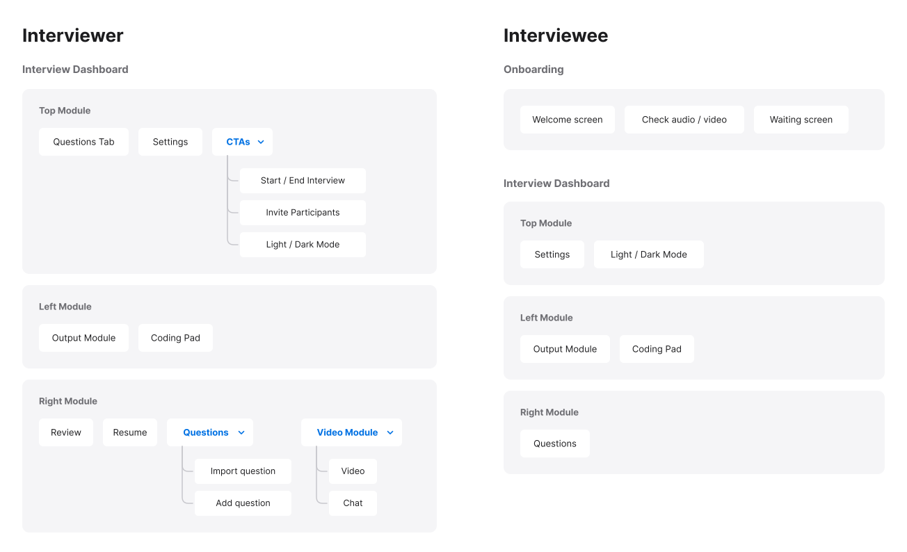
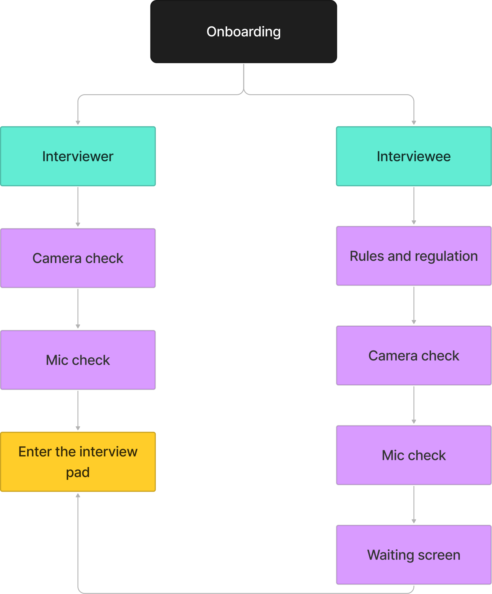
To solve the problem features being scattered, we decided to consolidate them in the dashboard. We also decided to add on boarding for both interviewers and interviewee to give them better context.
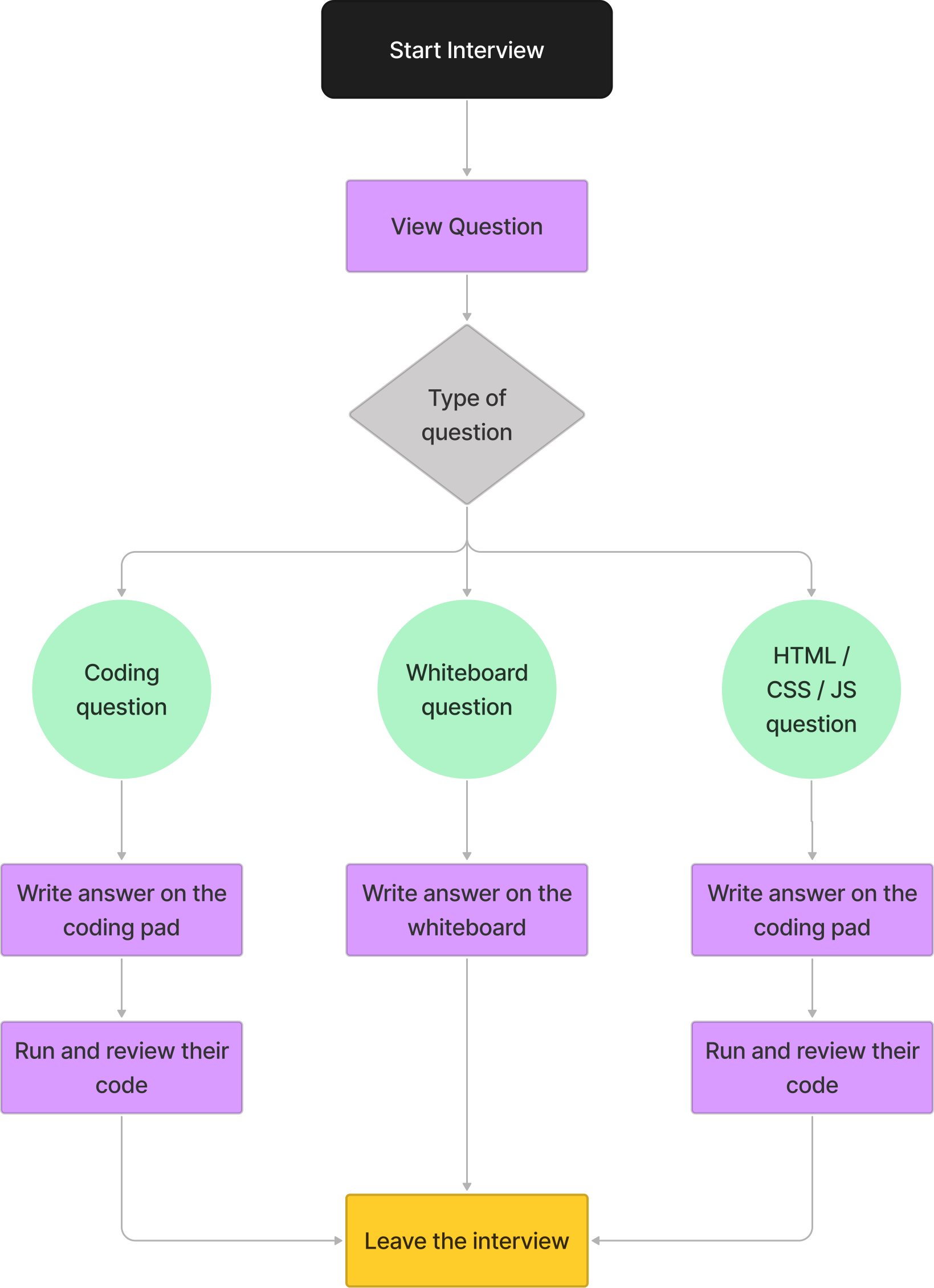
Mapping the dashboard journey
After finalizing the scope and functionalities that were gonna be included in the dashboard, we started building the user flows for both, interviewers and interviewees.
[IDENTITY]
04
One workspace. Everything within reach.
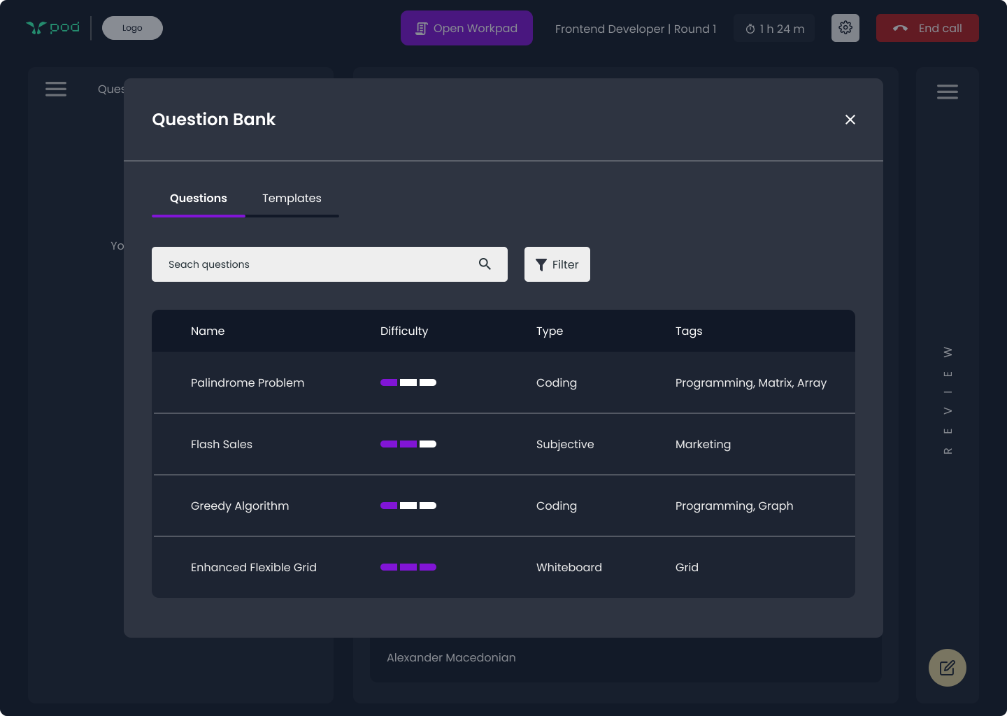
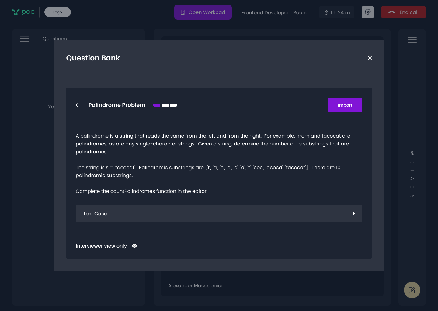
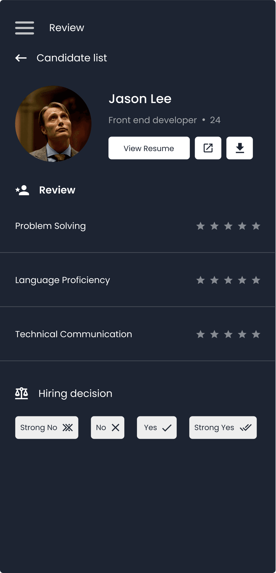
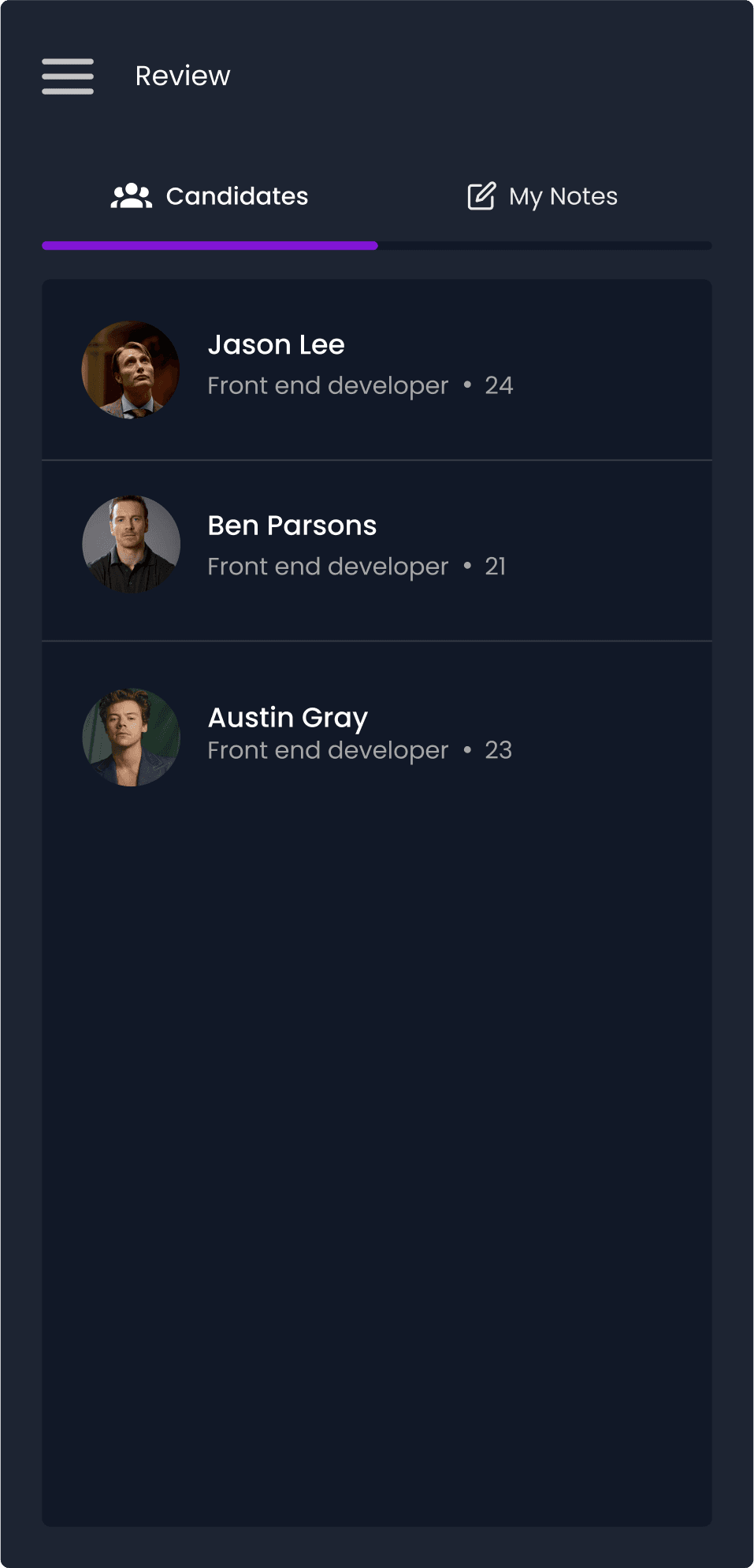
The redesign brought together key product improvements, starting with a clearer information architecture, simplified user journeys and insights from competitor analysis.
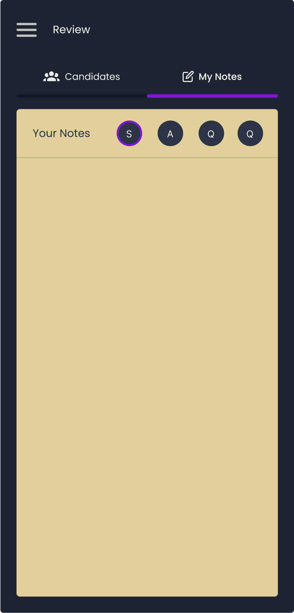
We restructured the platform around user needs, streamlined interviewer and candidate workflows, and consolidated essential interview tools into one intuitive workspace.
[RESULTS]
05
Better workflows. Better interviews.
By bringing essential tools into one workspace, simplifying navigation and creating more connected user journeys, we made interviews easier to manage for interviewers and more focused for candidates.